New Google-Adobe font makes Asian scripts consistent, and that’s a big deal
New Google-Adobe font makes Asian scripts consistent, and that’s a big deal

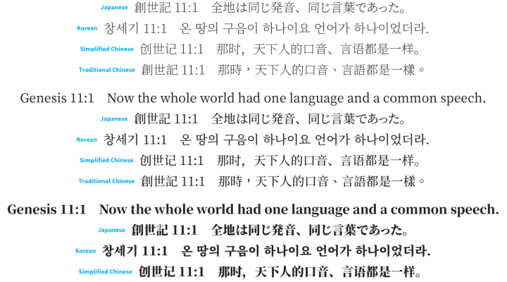
Earlier this month, Google and Adobe released something that might just make the world a bit more, well, Google-able: a brand new font that manages to make a consistent typeface for Chinese, Korean and Japanese scripts. The Noto serif CJK is the second such font to emerge from the Google/Adobe partnership, and it could have big implications for web designers the world over. Margaret Rhodes, staff writer for Wired magazine who covers design, reported on what makes the Noto serif CJK an accomplishment. She spoke with Marketplace host Kai Ryssdal about the font. An edited transcript of their conversation is below.
Kai Ryssdal: Google and Adobe worked together for years on this project. Why is a consistent font or typeset important to them?
Margaret Rhodes: This is important to them because Google has an international audience. So does Adobe. And when you have an international audience, you have people who need to create products across different languages. Before this existed, the only option that you would have is if you want to make your magazine available for readers in another country, you have to choose a totally different typeface. And when you do that, you forfeit this look you’ve created. You wanted it to have a feel; you choose another typeface [and] it might lose that feel. Or, if you have a need to use different languages in one screen or on one product, they kind of get jumbled. And Bob Jung at Google, he handles their internationalization efforts. He refers to that as the “ransom note effect.” So, you know, that kind of schizophrenic, jumbled look. So you don’t have that when you have access to fonts like these. So you have this fidelity across products. And then, you know, what is really cool is that as a designer or developer who, when you really care about your product, you get to show users in different countries that you are thinking of them. That you didn’t just sort of, you know, convert something made for a Chinese audience to Korean. It’s personal.
Ryssdal: Right, it’s respect for that audience. Well, and that actually gets to sort of an interesting part of this. We all know that Google is trying to take over the world, right? I mean, I say that tongue-in-cheek. But, I mean, that’s kind of the mission right? The mission is, they want to categorize all the world’s information and blah, blah, blah. It’s interesting that this American company is now designing these fonts and typefaces for an Asian audience.
Rhodes: Yes. Absolutely. There’s a lot of people who want to access these products. And I think there’s also a lot of people who use these different languages. And so being able to sort of, you know, bring them together visually is a pretty cool thing to be able to.
Ryssdal: Is it hard to do this design work? I mean, it took years, right? And probably lots more people sitting in a room.
Rhodes: Yeah. The reason that Google went to Adobe for these CJK — Chinese, Japanese, Korean scripts — it’s kind of due to this one guy, a linguist and a computer scientist who’s been at Adobe for a while. His name is Ken Lunde. And he has been studying these letter forms for years. He told me that he got interested in the topic when he was studying Japanese [in] 1985. But over the course of all these years, he has written books on the topic of how you handle these East Asian languages on a computer. If you were to pull up a Word document and you were to type your name in three different fronts. And let’s say you’ve got a lowercase ‘e’ in there. The curve in that ‘e’ could look different in each each version of your name. And that’s because the designer specifically chose to make that curve look differently. And they do that across the entire font they design. So in Latin languages, there are 26 letters, and then there is a smattering of characters, numbers. But in Chinese, Japanese, Korean scripts, there are tens of thousands of characters. So that miniscule work that goes into making one ‘e’ look like that ‘e,’ you multiply that work times thousands.
Correction (April 18, 2017): A previous version of this story misspelled Bob Jung’s name. The text has been corrected.
There’s a lot happening in the world. Through it all, Marketplace is here for you.
You rely on Marketplace to break down the world’s events and tell you how it affects you in a fact-based, approachable way. We rely on your financial support to keep making that possible.
Your donation today powers the independent journalism that you rely on. For just $5/month, you can help sustain Marketplace so we can keep reporting on the things that matter to you.


